created by Playdead
Let's talk about Limbo. I'm a huge fan of Xbox Arcade games; they're short and sweet. Limbo is no exception. This game has incredibly unique visuals that we haven't seen in this field yet, and its in these visuals I think they find success.
For those of you who haven't played the game (shame on you!), here's a little teaser to give you a quick summary.
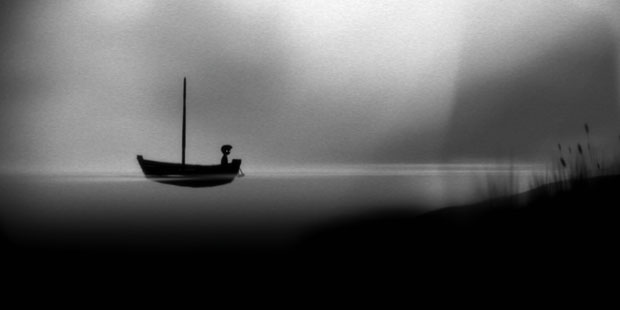
When displaying a greyscale image, special attention needs to be put on the value and contrast of the image. Can I read the foreground/background? What am I supposed to be looking at? Can I recognize everything? And most importantly, is it interesting? Limbo uses value and contrast extraordinary well; they're able to stand on their own as artist pieces. Without using color, the game has managed to convey a sense of emotion in a world of black and white.

Dem silhouettes...
Excellent value and contrast can only get you so far; what all good games need is some badass lighting. Limbo especially. The world in this game is meant to be dark and creepy, but the player has to be able to see at least some of the environment, right? In Limbo, lighting is used not only to make the environment easier to read, but to also guide and help the player. Usually, glowing objects in the game are key parts of a puzzle. Even the boy has eerie, glowing eyes so that the player does not get lose in darker areas. Combing the lighting and filtered camera give the game a movie film noir feel to it, without the use of realism. I'm an avid fan of stylized games; realism is becoming boring. I want something different from the usual color schemes of brown, brown, and more brown. Sure, Limbo doesn't offer me more color, but it does communicate a strong, emotion atmosphere without a massive amount of polygons. To quote Playdead's co-founder and CEO, Dino Patti, "We definitely feel it's best to avoid competing for realism and high polygon counts, instead focusing on making something with what you have. I believe in using the most resources on the essential parts of a game, and for me that is definitely the game play. That being said, creating something which feels like a complete package always takes a lot of time and dedication." I want to kiss this man. Game play is definitely the most essential part of a game, and spending a ridiculous amount of time on it shows.
/end massive wall of text
I'll move on to my next point, which combines both value, contrast, and lighting to form the super being known as atmosphere. As mentioned before, this game is creepy. This world is creepy. That boy is creepy! And a majority of this creep is achieved with atmosphere. The soft and foggy background mixed in with the diluted rays of light give Limbo its eerie feel. The entire game has no music, only environmental sounds, making immersion almost instant. I totally forgot about the real world as soon as this game starts. Limbo brings the player right into this creepy forest in god-knows-where and slowly takes you through even creepier tribal villages to industrial cities and beyond.

Really, Limbo? Bodies in crates?

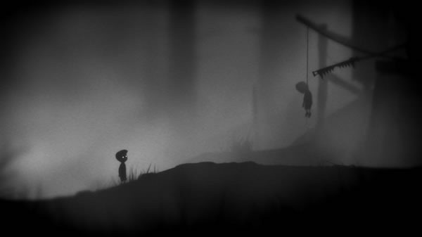
Is that...a hanged body?

Ah...yeah, that's definitely a hanged body.
I've given this game so much praise on its visuals, but what about this game play I speak so highly of? Yes, it's an incredibly fun game, but instead of ranting on about what was fun, I'd rather point out the things I believe this game lacked.
So let's talk about the progression of game play. When you start the game, game play starts immediately. You learn the few and easy mechanics of the game and the puzzles begin. There are giant insects, gruesome traps, but all of this terrifying fun turns into gravity puzzles near the end of the game. I can enjoy the transition from forest to industrial city, but that transition happened fast and I began to miss some of the earlier imagery the game had, as well as the sudden traps and puzzles the game threw at me.
And then there's what you actually do in the game, which is basically environment interaction, such as jumping, climbing, and moving objects around. There's nothing wrong with that, but other than these simple actions, there's nothing else going on in the environment. It's very still. Even subtle movements in the background, like a creature moving or a distant tree swaying would add to the overall atmosphere of the game. If the environment moved more and perhaps gave the player more to interact with, it would take away from the strictly linear structure of the game that can get a tad bit repetitive, like that whole gravity puzzle deal. Seriously, Limbo? The last half of the game felt like one giant gravity puzzle. And the gravity changes didn't even make sense in this world!
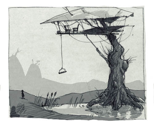
So it seems that all of my game design issues are stemming from these gravity puzzles that apparently consumed the entire game in a fit of repetitive-ness. But I think that's just a symptom of the main issue, which is the overall level design. I feel like they spent a large amount of their time and energy on the earlier parts of the game, which I have no complaints about. But the design seems to get dull and bland as the game nears an end. The environment is all the same, which is making game play all the same, since it's based off of the environment. In these types of games, the creation of the map and environment needs to be synced with mechanic design. While reading up on Limbo, I stumbled across some of its concept art.


Look at these designs! If the environment looked more like this, imagine the variety of game play you could get, instead of just areas with gears and boxes, toggling gravity on and off. These original sketches have more organic and foreign-looking architecture, which gives off a familiar yet unknown vibe that matches the essence of the game. So not only do these original designs give an opportunity for a variety of game play, but it also pushes the feeling this game is trying to convey to the player in this creepy and unsettling world.
This game is still amazing, and I suggest everyone play it. It's a great break from the norm, and yes, even the gravity puzzles can be exciting. It's cheap, it's short, it's fun, check it out!
If you've played this game before, I'd be interested in what you thought about it. Leave a comment if you feel active.
Erica
Erica


No comments:
Post a Comment